
Check how your site looks on a phone — and fix it
Last updated: 2026-11-11
Short version — open the “Mobile” tab in the editor's right column to see your site at phone width, and use the screen-size buttons on a template page to preview mobile before you even choose one. If text, buttons, or images look off, describe it in the “AI” tab, and after you publish, open the site once more on your own phone.
At a glance
- Time needed
- About 3 min
- Plan required
- Free plan
- Coding knowledge
- None
- Where to do it
- Editor
Step by step
- 1
Preview a template's mobile look before you pick it
On a template's detail page, press “Mobile” in the screen-size buttons above the preview and it redraws at phone width. Tablet and desktop are in the same spot. The preview renders at the chosen device's real width and then scales down, so you see the genuine mobile layout, like a menu that collapses or columns that stack. It works without logging in, so check that a template you like holds up on a phone first.
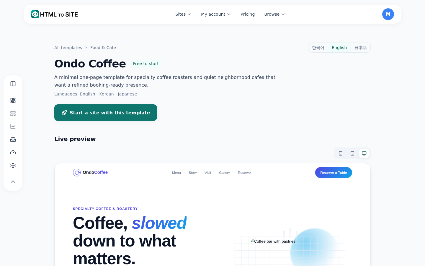
The screen-size buttons at the top right of the preview change the width. - 2
See phone width in the editor's “Mobile” tab
On a wide screen, open the “Mobile” tab in the editor's right column and a “Phone” view shows the page you're on at phone width (390px). It follows your edits a moment later and is view-only. Press “View larger” and the canvas itself switches to phone width, so you can click and edit right there. “Preview” at the top shows the published look with “PC” and “Mobile” buttons, and on a narrow device the same screen-width buttons sit in the “Tools” row at the bottom.
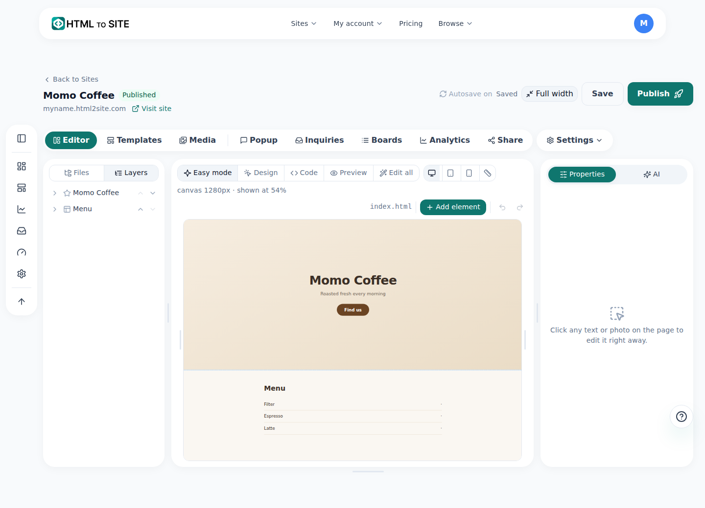
The “Mobile” tab in the right column opens the phone-width view. - 3
Ask the AI to fix what looks off
In the “AI” tab, describe the problem in the “AI editing” box and press “Ask AI”. Write it the way you see it: a button too small to tap, text cut off, a photo running off the screen. If you're not sure what to say, try the suggestion “Check the mobile layout”, and pick one section to get suggestions like “Shorter on mobile”. The AI shows “Proposed changes” first, and “Apply” puts them into your draft. Then check again in the “Mobile” tab.
AI editingOn mobile the booking button is too small and my shop name wraps into two cut-off lines. Make it easier to tap I'll fix the button size and the title wrapping — 2 places. - 4
After you publish, open it on your own phone
The screen that appears after you press “Publish” shows your address and a small QR code (“Open on your phone”). Scan it with your phone camera, or press “Copy address” and message the link to yourself. The editor's phone view is a preview matched to the width, so details like the real device's fonts or address bar can differ a little. A last look on a real phone is the most accurate, and if something needs a tweak, go back to the editor, fix it the same way, and publish again.
myname.mklyr.com LiveAfter publishing, open this address on your own phone to check it.
Frequently asked questions
Where can I check how my website looks on a phone?
On a wide screen, the editor's “Mobile” tab in the right column shows the phone-width view, and the “Mobile” button inside “Preview” does too. On a narrow device, use the screen-width buttons in the “Tools” row at the bottom.
Can I preview a template on mobile before choosing it?
Yes — press “Mobile” in the screen-size buttons on the template's detail page to see it at phone width. No login needed.
Can I fix mobile layout problems without knowing code?
Yes. Describe what's wrong in the “AI” tab and the AI shows “Proposed changes” first. The free plan includes a monthly AI allowance you can use for this.
If I edit on PC, does the phone version change too?
It's one site, so one edit applies to both PC and phone. HTML you brought in yourself depends on whether it was built to fit phone widths in the first place, so always check it in the “Mobile” tab.
Can the editor's mobile preview differ from a real phone?
The width matches, but fonts and the address bar vary by device, so it can differ slightly. Opening the published site on your own phone is the most accurate check.
Read next
- The editor's AI edit assistant: describe it, and it edits the code How the editor's AI edit assistant works — describe changes in plain language, click to point, publish to go live, and how revert really works (English)
- The template gallery: browse without logging in, edit, then publish How to use the template gallery (/templates) — from login-free browsing to draft, editing, and publishing (English)
- A small business website, free: pick a template, edit it by asking, publish How to build a small business website for free — pick a template, edit on screen or with AI, inquiry form, publish, own domain (English)
- Get your site found — by search engines and AI answers alike How to get a published site found by search engines and AI answers (AEO) — from site settings to structured data (English)
Trying it is faster than reading about it — create your site now, free.